Timeline
Tools
Client
My Role
I work as a solo Product designer. My responsibility includes:
User Research: User Interview, Affinity Mapping, User Journey Map
Ideation: Wireframe
Hi-Fi Interface Design
Testing: A/B Testing, Usability Testing
Design System: Components Library
delivery
Project Type
3 weeks. Oct 2024.
Figma, Google Forms, Excel.
3 interface, 10+ components, 5 interactions, 1 feature
Passion Project
Problem
Redesign Goals
Results
P. I Art school is an art education institution. When I was a student here, many of my classmates has revealed school system was clunky, sometimes they had a hard time dealing with it.
Make school system efficient and intuitive for students to fulfill everyday routine tasks. Increase engagement and satisfaction rate.
1. Improve the visual hierarchy, attune to user habits.
2. Reprioritize the modules in landing page, add shortcuts to frequently used functions.
3. Streamline the user journey for students to upload assignments.
4. Attune the interaction to specific user case.
The redesigned website features a clean, clutter-free interface, making it easier for users to navigate and access essential features.
29%
Increase in average task completion rate
67%
Improved in finding assignment process
95%
User satisfaction rate

CONTEXT
The Old Design
“It feels like a 90s website.”
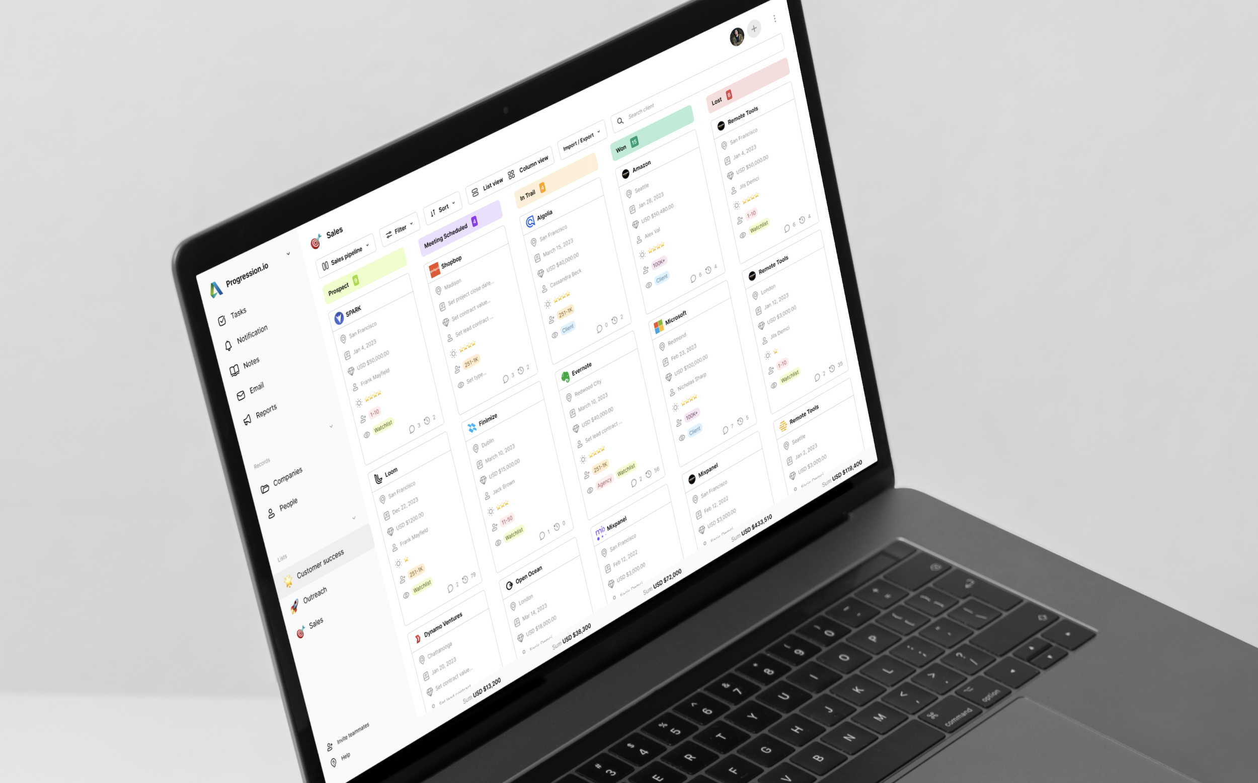
More than few times I heard my classmates complain about the school system. Besides the retro look, it was often clunky when students/teachers complete their essential tasks.
USER RESEARCH
Discover the problem space & Define the Research Insights
Step 1 – Unmoderated usability testing
I conduct usability testing with five participants to identify problems and uncover their needs. I initiated unmoderated testing, allowing users to explore the sales page on their own, and asked them to share what was working and what wasn't.
Usability Testing photo
Base rating of existing platform
Users’ insights
3 people navigation is not prominent in the sales page.
2 people said the card is not scannable.
2 people said it’s not easy to find the client they want.
1 people said it’s not easy to copy the clients’s information.
1 people said it was frustrating to manually add clients’ information.
Step2 - Set the evaluation framework
I asked users what they value most when using a CRM platform, then explored which features and functions were most important to them. Based on their responses, I developed an evaluation framework for the CRM platform, along with benchmark ratings for the existing platform.
Evaluation framework
Ease of Use: The system should be intuitive and easy to understand.
Speed: It should allow for quick sharing of client information.
Automation: The system should be "smarter" by automating routine tasks.
DEFINE
User Persona
Based on the research insights, I created a persona to highlight their pain points and goals.
DESIGN EXPLORATION
Version 1
Before - Lack navigation on the dashboard.
Status bar is not prominent. This makes it harder for users to understand how cards are classified by status.
Redundant status tags overwhelm the users. Especially since 'In Trail' and 'Procurement' are so similar..
Menu texts are too small. Users have to zoomed while checking information.

After - A clear visual thread to navigate.
I use colored label to highlight status bar. As they are meant to help users navigate and track all client deals.
Apply Miller’s Law to page layout. I organize the content into less chunks to help users process and understand.
Improve text hierarchy. I use larger fonts for menu items and bolder fonts for buttons, to distinguish them from body text.
Sales dashboard, redesign version 1
Users’ Rating of sales dashboard, version1
“Now I can find the information very easily!”
“It’s easy, but not fast enough. ”
DISCOVER
Straight up, what’re the usability issues?
Audit gives a solid footing for later steps.
To discover the problem space, I start with existing school system audit using FigJam.
Audit full view via FigJam
PROBLEM 1
Frequently used modules are hidden on landing page.
Class and assignment modules are hidden in landing page while irrelevant information takes prominent screen real estate.
Landing Page, before


Audit
User Interview
Affinity Mapping
Pinpoint Problems
Design Priority
Discover & Define
Exploration & Iteration
Design Exploration
Prototyping
A/B Testing
SKETCH
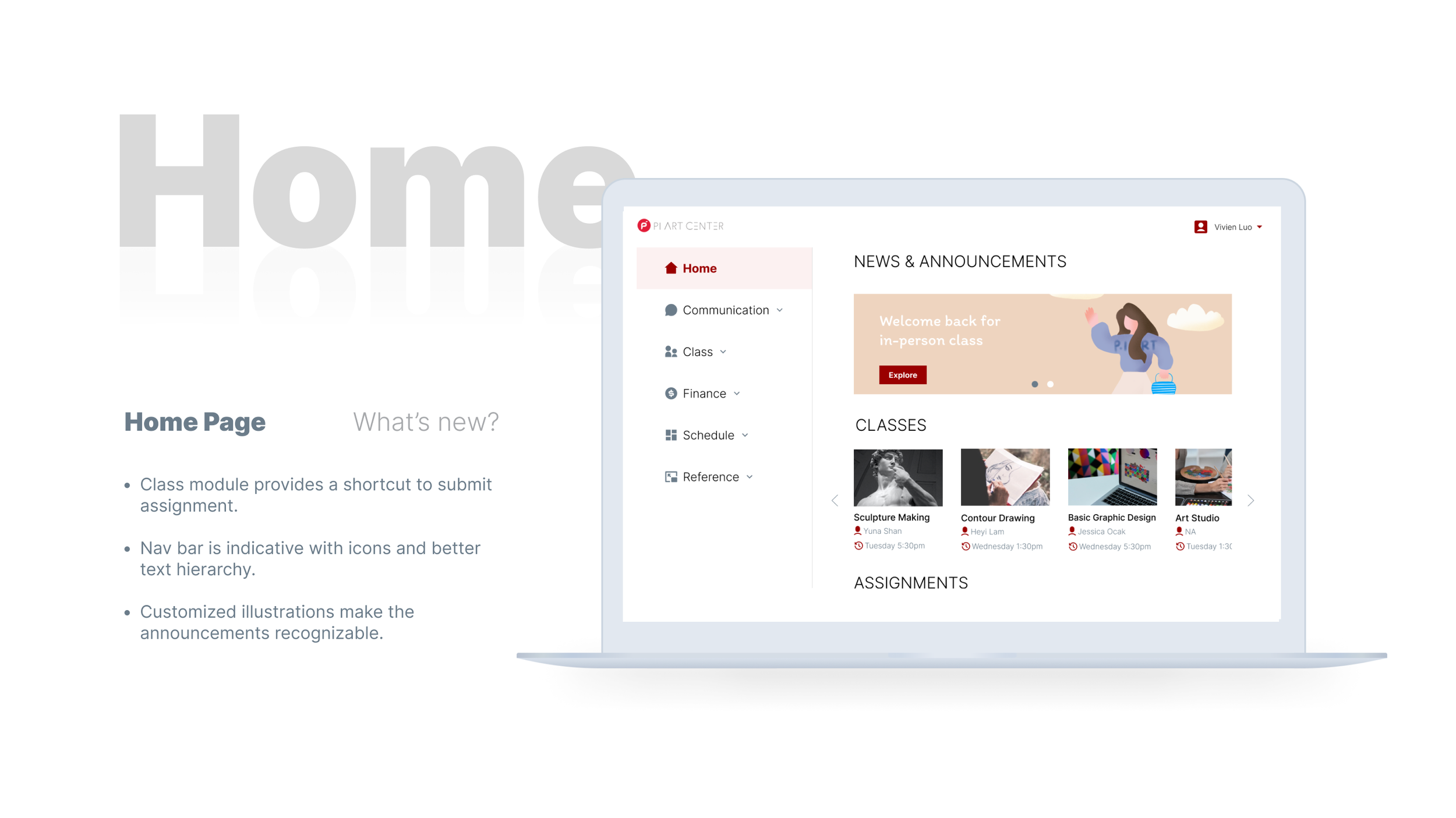
A shortcut to class should be incorporated.
I brainstorm the layout and modules for landing page. Since “go to class“ is a main task, I pay extra attention to the class module design.
Design Pattern sketches
DECISION TO BE MADE
🖼 Horizontal carousel, or 📆 calendar View?
There’re 2 forms of class module come into my brain: first is an image carousel, and second is a calendar view. They both have pros and cons.
Course module, Image carousel
✅ Images help distinguish classes
✅ Large touch area
❌ Doesn’t provide schedule tracking
A/B TESTING
RATIONALE
VARIATION COMPARISON
❌ Background contrast issue (according to WebAIM.org)
Course module, Calendar view
✅ Track class schedules, enable week and month switch
❌ Small touch area
❌ More information provided once, increase cognitive load
Testing uncovers which variation mostly suits the use case.
To find out which variation mostly fits specific use case, I conduct A/B testing with 5 participants. I record their votes, write down their feedbacks. It helps me make the decision.
Online testing via Google Meet & in-person testing
I choose carousel variation based on the following testing insight:
Course carousel is more suitable for this use case, because it has larger touch area. Besides, the images help recognize different classes.
Whereas for calendar view, the texts are too small, students don’t have tons of schedules to track, either.
Optimize accessibility. Fine tune the information display.
Then I move on to tweak the carousel display, where in style 1 I tried a dark overlay but later I realize there is potential contrast issue according to WebAIM, so I adopted style 2, variation 6, which resolve the contrast issue, also gives more information about teacher and time.
Carousel style 1, Variation 1,2,3
Carousel style 2, Variation 4,5,6
✅ Resolve contrast and focus issue
✅ give essential info regarding teacher’s name and class time
PROBLEM 2
Another challenge comes up:
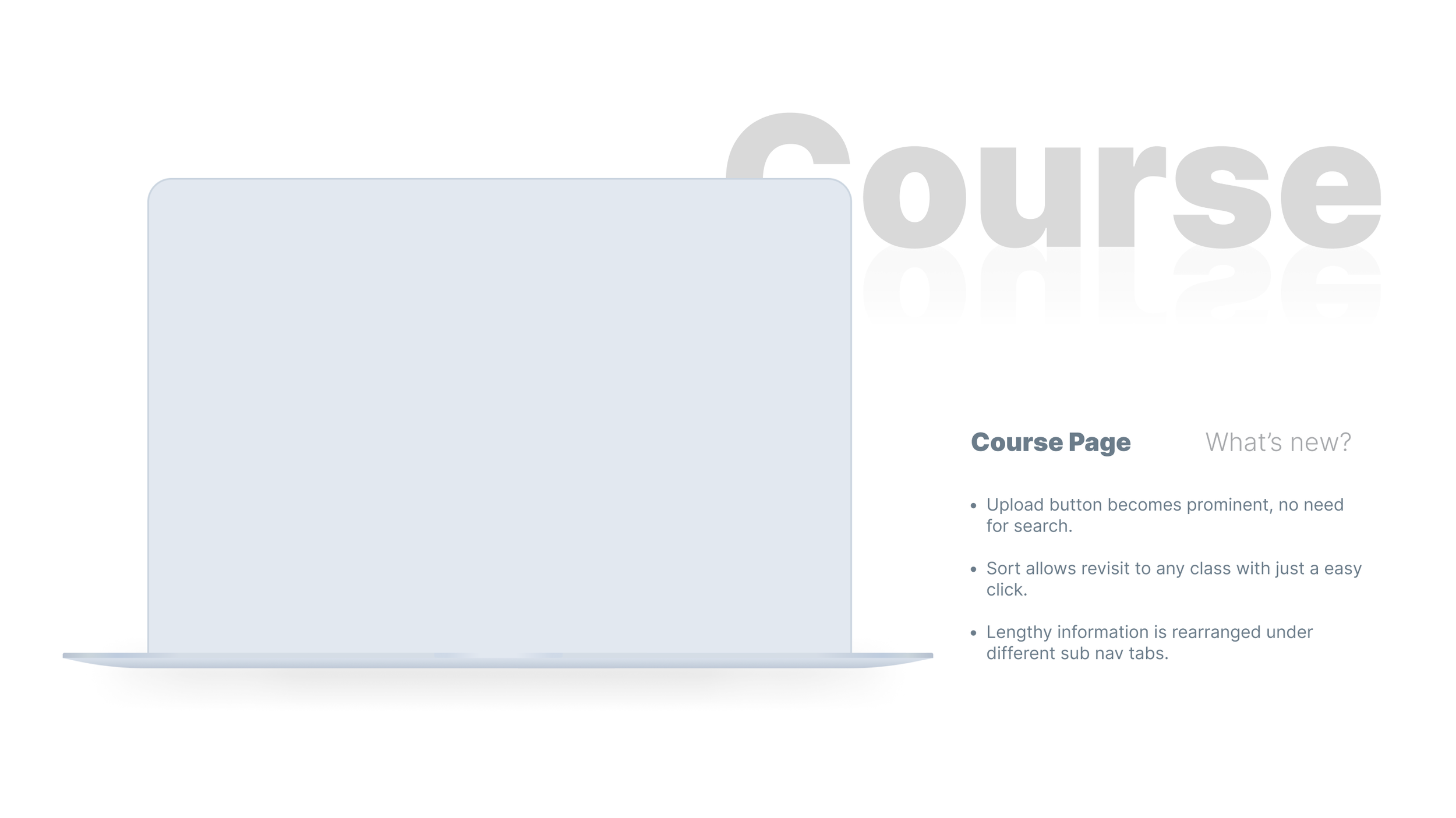
It takes too many steps to find the right assignment card.
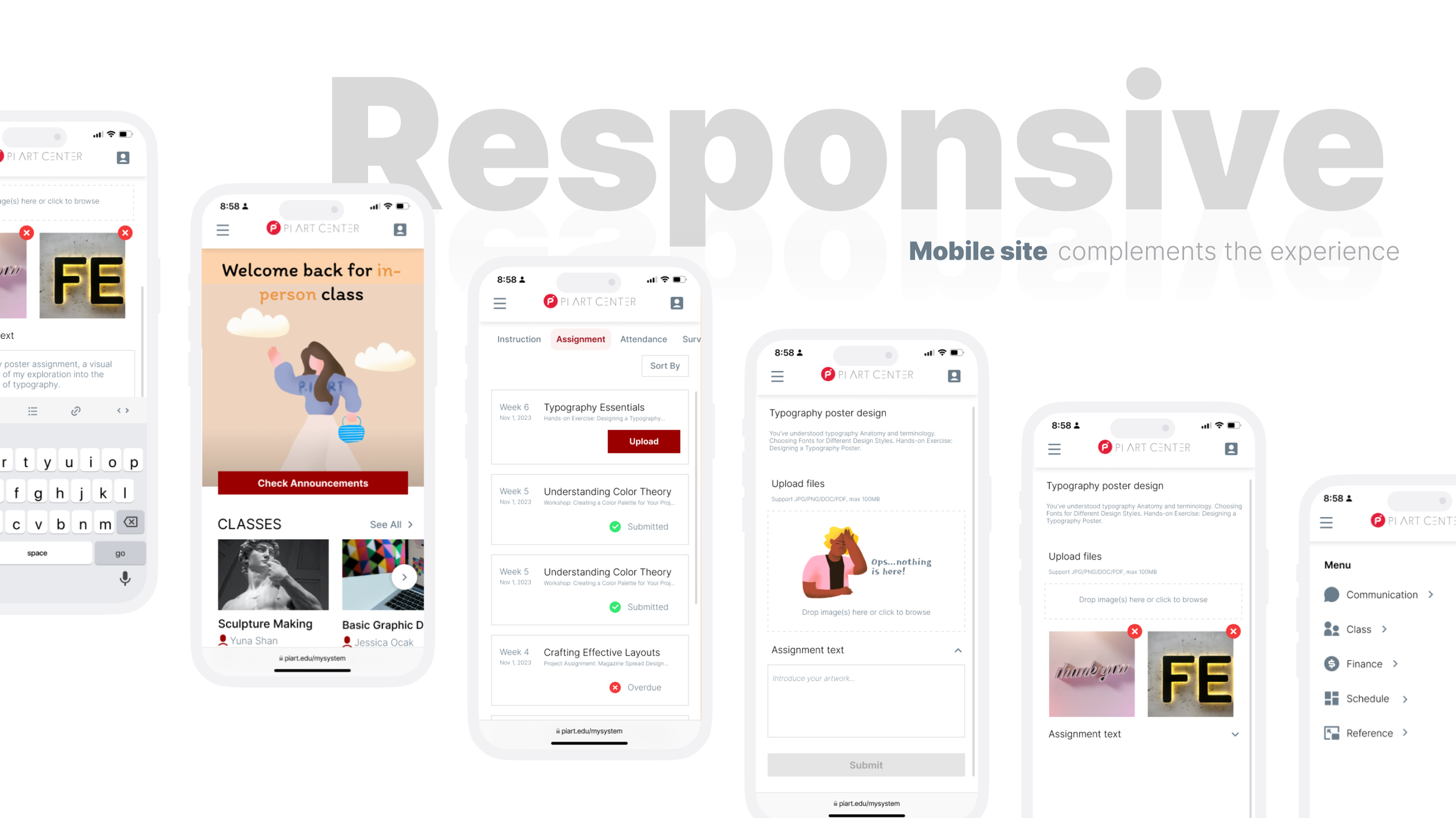
Another challenge is the assignment card. the previous design doesn’t display information in a direct and concise way, make students unfold every title to check if it is the right week to upload assignment. In my redesign, I add necessary indications for students to recognize the right one at first glance.
Assignment card, before redesign
❌ Titles lack date, unfold to check more info
❌ Latest class at bottom, sequence from old to new
❌ Upload button is small and hidden
Assignment card, after redesign
✅ Title includes week, date, short content, and status
✅ Latest assignment on top, sequence from new to old
✅ Big CTA button for “Upload”
PROBLEM 3
In fact, Students submit pictures a lot more than texts.
but wait… text box takes up majority of the screen?
Students’ primary use case is submitting one or multiple images to get attendance check. However, they scarcely use the text box. To match the real use case, I change the proportion, enlarged the image box and shrink the text box.
Page proportion, before redesign
❌ Image upload button is basic, not indicative for batch
❌ Text box is underutilized, but takes prominent space
ILLUSTRATION DESIGN
Page proportion, after redesign
✅ Image upload button changes into a versatile box, indicative for batch
✅ Text box shrinks, leaving space for image upload
A bit humor motivates students to complete the task.
Due to peak-end ux law, I drew the illustrations in order to motivates students to complete the task, as well as a success illustration to paise users fulfill tasks.
Motivating & rewarding illustrations
Prototype
Evaluation
Process
Spread Sheet
Success Metric
Testing process
Be specific, be accurate
To remove the possible bias, I recruited 6 participants who didn’t use the school system before. The process goes like following: I used a spread sheet to record if participants successfully go through, or fail at certain task. One for existing school system, and the other for my redesign.
Task completion rate, before redesign
Success Result
Task completion rate, after redesign
Next Steps
1. Test with different user group, like current students. Adopt other metric to measure.
2. Figure out why task completion rate doesn’t improve much on assignment page. More iteration if needed.
I want to conduct more user testing. Especially, I especially want to try test with students, I believe their feedback will be very insightful. If test with them, since they already know how to use the system, I might adopt another metric, maybe like the time they spend on each task, to evaluate the redesign.
I also want to iterate the assignment page more, because I found the completion rate did not improve much in this specific task, I want to learn more about user feedback, maybe the new design pattern is relatively new and requires a learning curve, or it’s not so intuitive, or need further improvement.


